

Meaning behind the Northwest Airlines logo?
A company’s logo is its visual identity, a symbol of legacy. A good logo can make a brand stand out in the eyes of the consumer from its competitors and we, as a primary logo designing agency, understand its importance. Northwest Airline’s logo had a similar effect on people.
One of the primary airlines in the United States founded in 1926, Northwest Airlines Corp. became a home name in the aviation industry right from its launch. Before its merger in 2013, it was one of the biggest airlines in the US and a known brand worldwide.
Northwest Airlines logo has gone through multiple changes through the years, each reflecting the transformation stages of the company. One thing the logos upheld through all these changes is its timelessness, representing the company’s continued growth.
Let us take a look at the journey of the iconic Northwest Airlines logo through all its stages.
- The first iterations of the logo featured a very simple and basic design – a stylized “N” over a picture of the earth, representing the airline’s goal of connecting people across the globe.
- A big change occurred in the 1960s when the logo was redesigned with some bold features. This daring step in the direction of redesigning played in the favour of Northwest Airlines because people started to recognize it easily.
- The addition was the iconic red tail fin along with a sleek compass sign. It depicted their innovative personality – a symbol of strength and reliability in the sky, making customers feel safe.
- After multiple changes and alterations, the final logo of Northwest Airlines is one to remember and most people do.

Creator of the Northwest Airlines logo
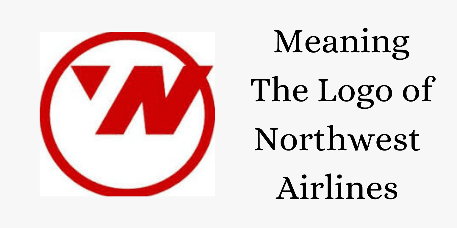
The iconic Northwest Airlines logo that we all know today was designed by Landor Associates. It has a triangle within a circle, the triangle serves the purpose of implying both a W and N. Blended in the colors of the brand, red and grey, the logo is a timeless icon.
In the next section, we will delve deeper and understand the meaning behind the logo.
Northwest Airlines logo hidden meaning
Logos may often seem simple but they are curated with great precision and thought. They take a long time to be designed and approved and are usually made by experts.
Similarly, the Northwest Airlines logo may seem straightforward at first glance but a closer look will reveal so many hidden meanings behind every small nook and design. Let us break it down.
The Red Tail Fin
It can be ignored as just an aesthetic addition to the design but it represents a lot more than that. It is a symbol of strength and vitality. It symbolizes the company’s non-wavering commitment to doing better and achieving excellence.
The triangle (compass)
Present within the red tail fin, the triangle acts as a compass. Interestingly, it points towards the direction the company is named after. Yes, it points toward the Northwest direction. It symbolizes trust between the passengers and the airline, the airline acting as a reliable guide.
An interesting blend
The logo has blended its traditional elements with modern ideas to showcase the legacy. It is a testament to NWA’s ability to evolve, innovate, and adopt.
Northwest Airlines stood the test of time and so did its logo. Even with multiple changes throughout the years, it stuck with people, as a trusted brand does. In the age of digitization and the internet, it’s very easy to ignore the content but one thing that catches attention is an image – a logo. It is a no-brainer to say that NWA’s logo does exactly that.