Table of Contents
ToggleAccenture logo meaning
The global company Accenture logo meaning has an interesting backstory that we will be reading about in further sections. In a world where a new business or startup pops up every minute, Accenture has stood the test of time and has become a global name.
Started as a business and technology consulting division of accounting firm Arthur Anderson in the 1950s, Accenture is a Fortune Global 500 company. In August 2000, Accenture broke off from Arther Anderson and became a separate IT services and consulting multinational firm based in the US.
A company’s logo represents it visually, however, if you look at Accenture’s logo, it would come off as too simple confusing people as to what it means. A logo doesn’t have to be extravagant or very difficult to comprehend for it to be a good logo, just take the example of Allahabad Bank’s logo.
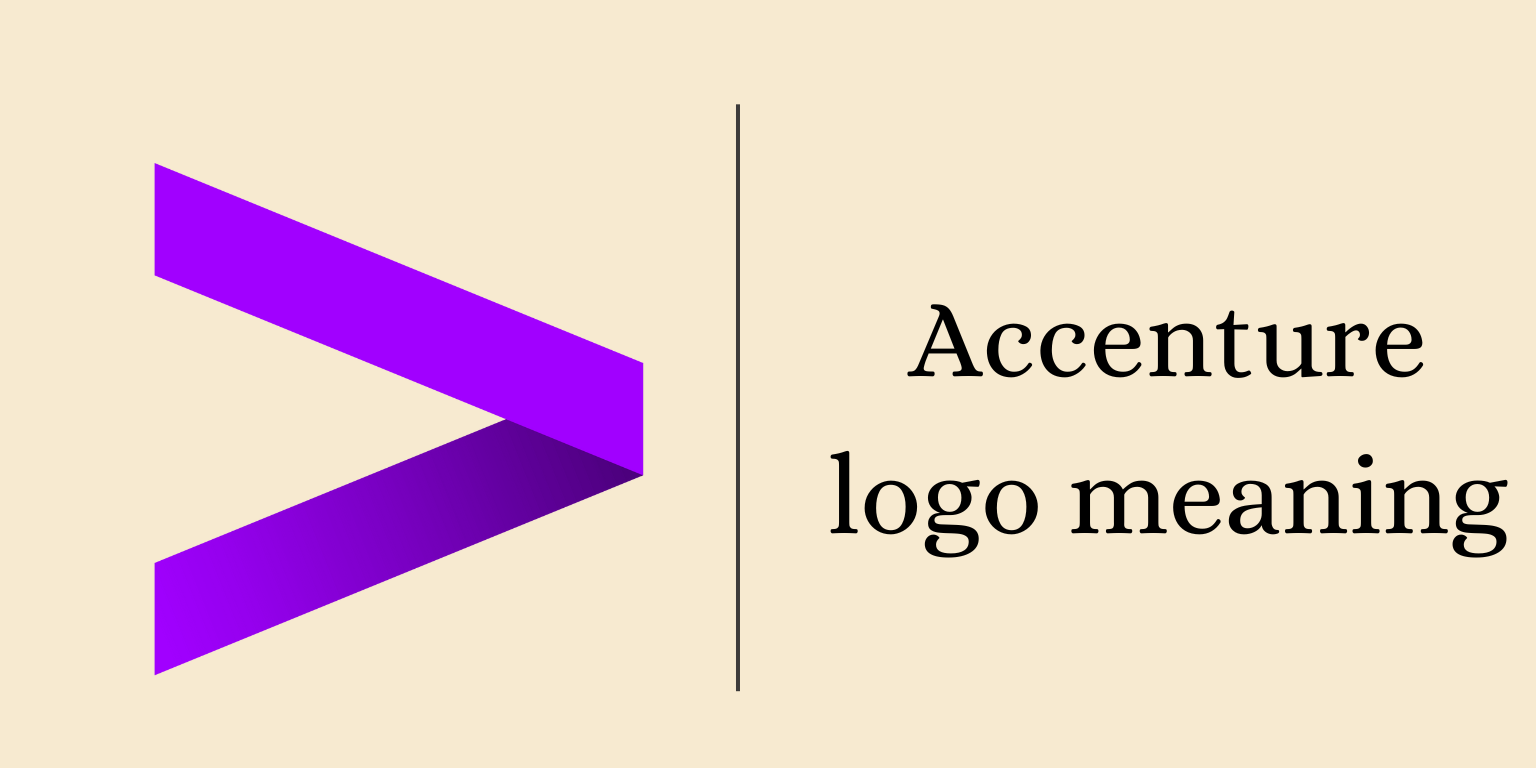
Accenture’s logo is the same. It’s simple, even easy to draw, and most importantly visually rememberable and appealing. It appears like a ‘greater than’ sign from mathematics.
Accenture logo meaning and motto of Accenture?
The motto of Accenture isn’t officially specified. There have been many mottos the company has used over the years without officially claiming any. A famous one is “Let there be change”.
Through this motto, the company propagates change, innovation, evolution, and improvement. Change is constant. With the upcoming trends in the business world, the evolution of AI, and the introduction of new technologies, an organisation must keep changing as per the needs. Flexibility is a must.
It emphasises client needs and how the company is dynamic and flexible according to what the client demands. The company is dedicated to achieving tangible outcomes for its clients and has created a brand image surrounding the same.
What is the meaning of Accenture and its logo?
The name Accenture came into existence when the firm separated from Arthur Anderson in 2000 and the firm needed to change its name legally. Accenture may sound like an odd term but even the naming of the firm just like designing the logo was done very cleverly.
Accenture is a coined word that connotes putting emphasis or accent on the future, just as what Accenture does, putting the client’s goals first and emphasising a great future for the firm. Or a few theories go, as the English word ‘Accentuates’ means ‘making noticeable’, the name of the firm was derived from their meaning making the clients more noticeable.
The logo is a simple mathematical symbol for ‘greater than’ which we write as “>”. It is fun, simple, and a great example of symbolism. It has multiple meanings if we think clearly. It can mean the company is better than others, or it symbolizes the company’s eagerness to help clients. It signifies the company’s openness, accessibility, and enthusiasm. Accenture logo meaning has many facets to it.
History of the Accenture logo
Accenture’s logo history is really interesting and different. It is not something we come across every day. It took three months for Anderson Consulting’s business consultant Mr. Kim Peterson to come up with the company name Accenture.
Accenture’s logo has remained the same from the beginning, for the most part at least. One thing that kept changing through the years was the colour of the logo and the company name written on the bottom.
- From 2001-2017, the logo was used in a regular red colour with Accenture written below it in a funky font.
- After that, for a year, from 2017-2018, the colour changed to deep dark red with the symbol becoming a bit bold in design and the font of Accenture made more simple and decent. After that, the logo design has remained constant.
- From 2018-2020, the colour of the logo changed to bright blue, and the font with which Accenture was written remained the same.
- In 2020, the final change in the design was made. The colour of the logo was changed to purple and the design continues to date.
Creator of the Accenture logo
The final change in Accenture’s logo was done in 2020 with a new marketing campaign which Accenture developed in collaboration with an acclaimed creative agency Droga5. The logo was designed by the creative team of Droga5.
Accenture logo meaning has a simple yet meaningful look. Every company aims to create logos that will last a long time and make an impression on their consumers. We, as a logo development agency, create similar meaningful logos for our clients because logos are a company’s visual identity and there should be no compromise with them. Accenture showed how to do it best.

