

Table of Contents
ToggleWhat Is A Pictorial Logo?
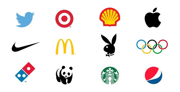
Logos are the visual identity of a company. A lot can be conveyed about the company through a logo. Of all the logos out there, a pictorial logo can be said to be the most informative. Let us understand what a pictorial logo is.
Pictorial logos are also called symbol logos as they are simply symbols that represent the brand or its functions through a visual image or icon. They are created in the form of icons, illustrations, or shape compositions, they are easy to recognize as they depict the brand directly or its functions through the logo.
A pictorial logo can be used alone or with a combination of symbols, texts, and designs. Unlike logotypes, which usually use only text in their logos, pictorial logos use mainly graphics to represent the company visually.
What Is A Pictorial Logomark?
A pictorial “logomark” is another term for a pictorial logo, they are often used interchangeably. Logomark generally refers to the graphics, symbols, and icons that are used in pictorial logos. Brands use logomarks to stand out and to make their logos distinctive by making them visually aesthetic and meaningful.
What Is A Pictorial Logo Design?
If a company has been operating for a long time, their logo becomes an identifier for them. So, companies try to create logos that people will remember for a long time and that will catch their eye instantly.
A pictorial logo design refers to creating a visually appealing design to be used as the company’s logo. These pictorial logo designs are created by experts, designers, and graphic designers as they require great attention to detail and an expert’s eye to not make any flaws. The key to creating a great pictorial logo design is keeping a healthy balance between creativity and clarity. The design should communicate the brand’s message clearly to the audience.
What Is A Pictorial Logo Or Abstract Logo?
Pictorial logos and abstract logos are almost the same except for one significant difference. Pictorial logos are clear symbols or icons that represent the brand, on the other hand, abstract logos – as the name suggests, are abstract.
They rely on shapes, colors, and compositions to convey meaning. They are usually metaphorical, breaking the identity of the brand in simplified form. As abstract logos are not “pre-defined”, they give the designer a chance to experiment and think out of the box. It leaves room for creativity.
Abstract logos should be used when you are sure what you want to convey through the logo about your brand. A famous example of an abstract logo would be Airbnb’s logo.
Conclusion
A good and distinctive logo is essential for a brand to stand out. We know that because we create such logos for our clients as a logo development agency. Pictorial logos can be a great option for companies. They are crisp, clear, visually appealing, and most importantly, they connect with the consumers. They give the brands room for creativity and experimentation. A good pictorial logo can go a long way for companies if they hit the right chord with the audience.